So what is colour in marketing, really?
Colour plays a pivotal role in the world of marketing in more ways than you’d think: serving as a powerful tool to influence consumer behaviour and shape perceptions.
Different colours can evoke specific emotions, trigger psychological responses, and even drive purchasing decisions. How, you may ask? Understanding the principles of colour theory and how they apply to marketing is key for creating effective branding, advertising, and product design.
In this blog we are delving into the fascinating world of colour theory. Exploring how various colours affect emotions and behaviour, the cultural influences on colour perception, and the strategic use of colour in branding and advertising. Using these valuable insights, you can harness the power of colour to enhance your marketing efforts and connect more deeply with your audience.
Understanding Colour Theory
Imagine a world without the vibrant splash of colour. Pretty dull, right? Colour brings so much to our day to day and we often take it for granted. But the thing is, all the colours around us are chosen for very specific reasons. That’s where colour theory comes in; a blend of science and art.
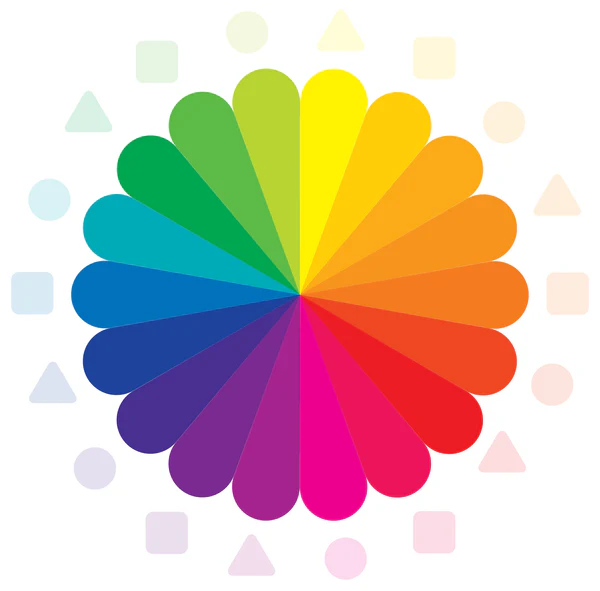
At its core, colour theory is about understanding how colours work together and to do this, we need to look at the colour wheel.
It starts with primary colours (red, blue, yellow), which mix to form secondary colours (green, orange, purple), and then further blend into tertiary colours. The colour wheel is an essential tool in the design process, guiding designers in creating visually appealing combinations that will best impact the target audience. This wheel helps in balancing colours and ensuring designs are both attractive and effective.

Psychological Effects of Colours
Colours have a remarkable ability to influence our emotions and behaviour, often in ways we might not even realise. For instance, red is known to evoke feelings of excitement, urgency, and passion, making it a popular choice for sales and clearance signs. Blue, on the other hand, promotes trust, calmness, and reliability, which is why it’s often used by financial institutions. Green is associated with health, tranquillity, and nature, perfect for wellness and environmental brands. Yellow brings about feelings of optimism, energy, and draws attention, making it great for highlighting important information. Orange exudes enthusiasm, creativity, and warmth, while purple suggests luxury, wisdom, and spirituality. Black conveys sophistication, power, and elegance, ideal for high-end products, whereas white signifies purity, simplicity, and cleanliness, often used in minimalist designs.
Understanding these psychological responses can help marketers choose the right colours to connect with their audience effectively.
Colour and Emotion
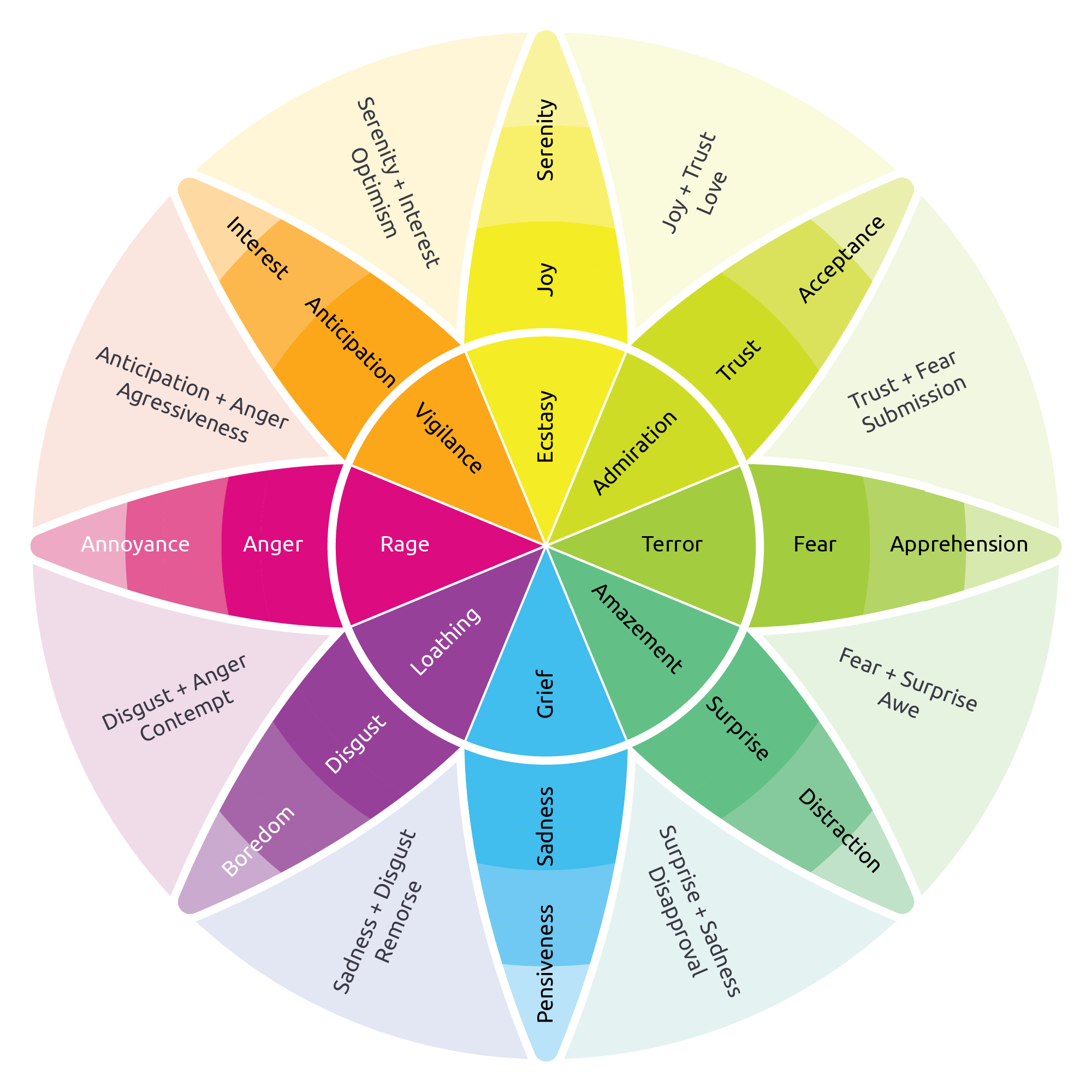
The emotion wheel further illustrates how colours can evoke a wide range of feelings by categorising emotions into primary, secondary, and tertiary levels. By visualising emotions in a wheel format, it becomes clearer how closely related feelings can shift and interconnect, offering deeper insights into the powerful impact of colour on human emotions. This tool is invaluable for designers and marketers aiming to evoke specific emotional responses through their choice of colour.

Cultural Influences on Colour Perception
Cultural backgrounds play a significant role in how colours are perceived, meaning that a colour’s impact can vary dramatically from one culture to another. For example, while white is often associated with purity and cleanliness in Western cultures, it is traditionally linked with mourning and funerals in many Eastern cultures. Similarly, red signifies good fortune and joy in China, making it a popular choice for celebrations, whereas it can represent danger or warning in other contexts.
These variations highlight the importance of considering cultural context when marketing internationally. Failing to account for cultural differences in colour perception can lead to misunderstandings and even offend potential customers. By being aware of these cultural nuances, marketers can create more effective and culturally sensitive campaigns that resonate with diverse audiences.
Colour in Branding and Logo Design
When it comes to brand identity, colour isn’t just a design choice—it’s a secret weapon. Just look at Coca-Cola’s iconic red, which screams excitement and energy, or Tiffany & Co.’s distinct blue, exuding luxury and sophistication. These brands didn’t just pick colours randomly, they strategically chose hues that align perfectly with their brand values and messages. Want to hit the colour jackpot for your brand? Start by understanding your brand’s personality and the emotions you want to evoke. Then, consider your target audience and cultural nuances. And remember, consistency is key! Stick to your chosen palette across all brand materials to build a strong, recognisable identity. With the right colours, your brand can leave a lasting impression.
Colour in Advertising and Packaging
Colour isn’t just a visual treat in advertisements, it’s a persuasive tactic that drives consumer decisions. Imagine walking down an aisle, and a bright red sale sign catches your eye, instantly triggering a sense of urgency. That’s the magic of colour at work. In product packaging, colour can be the difference between a product flying off the shelves or gathering dust. Take Cadbury’s use of purple, which signals luxury and indulgence, making their chocolate feel like a special treat. Light blue also symbolises ‘light’ versions of food and drink products, letting customers know it’s the healthier option. Effective campaigns harness these colour cues to influence buying behaviour subtly but powerfully. By strategically using colour, advertisers can create compelling messages that resonate, engage, and ultimately convert.
Colour Trends in Marketing
In the ever-evolving marketing industry, staying ahead of colour trends can give brands a competitive edge. Currently, earthy tones and muted palettes are trending, reflecting a shift towards sustainability and authenticity. Digital realms are embracing vibrant, neon hues to capture attention in a crowded online space.
To keep up with these evolving trends, marketers should follow design blogs, participate in industry webinars, and pay attention to annual colour forecasts from authorities like Pantone. Looking ahead, we can expect a rise in biophilic design, with colours inspired by nature, and a continued fascination with nostalgic palettes that evoke a sense of comfort and familiarity.
Staying tuned to these trends ensures your brand remains relevant and visually captivating.
Practical Tips for Marketers
Selecting the right colours for your marketing materials can be a game changer.
- First, know your audience. Different demographics respond uniquely to colours.
- Use tools like Adobe Color or Colors to experiment with palettes and ensure they align with your brand’s personality.
- Consistency is key, so maintain a cohesive colour scheme across all platforms.
- Avoid common mistakes like overloading on bright colours, which can overwhelm, or ignoring colour contrast, which affects readability.
- Test your choices by seeking feedback and analysing engagement metrics.
- By thoughtfully selecting and using colours, you can create impactful marketing materials that truly resonate with your audience.
In the colourful world of marketing, mastering colour theory is like having a secret superpower. From evoking emotions to shaping perceptions, the right colours can make or break a brand. Nail your brand’s identity by choosing a consistent palette that resonates deeply with your audience.
